Clari-Fi helps to evaluate the visual clarity (i.e. perceptibility) of the icons, images and text that appear within mobile websites, apps or banner adverts.
This page describes why Clari-Fi should be used to assess mobile websites, apps or banner adverts, then gives further details on who should perform the assessment, and how it should be done. A worked example is then used to describe each of the Clari-Fi Check Levels in turn (these are named Check Level AAA, Check Level AA and Check Level A). Finally, a summary is presented of the assessment process, and the calibration to population data.
The Free version of this tool processes one image at a time, and only shows Check Level AA. The Pro version of this tool allows you to process multiple images, and shows all 3 Check Levels.
On this page:
Clari-Fi helps to evaluate the visual clarity (i.e. perceptibility) of the icons, images and text that appear within mobile websites and apps.
Why should Clari-Fi be used to assess mobile websites, apps or banner adverts?
Mobile websites, apps and banner adverts often contain lots of icons, images and text. Clari-Fi enables the visual clarity (i.e. perceptibility) of these graphical features to be evaluated on a large screen device, and uses blurring to simulate the challenges of viewing these features on a mobile device. Therefore, Clari-Fi speeds up the process of designing and developing these graphical features.
The level of blurring that’s applied by Clari-Fi is calibrated to survey data that was gathered using a handheld test card, so the design team can be confident that if their graphical features appear ‘easy to see’ in the blurred version of the mobile screenshot, then the vast majority of their users will find these features ‘easy to see’ on their mobile devices. Importantly though, Clari-Fi considers people who might have difficulty perceiving graphical features because of visual acuity issues. Some people may have difficulty perceiving graphical details for other reasons, especially colourblindness.
Who should perform the assessment
Using Clari-Fi to assess graphical features within mobile websites and apps is more objective than an assessor looking at an unblurred version of these graphical features, and deciding if they think they are clear enough.
However, some degree of subjectivity remains in the process, because the assessor's familiarity with the app or website influences the amount of detail that they need to perceive in order to successfully interact with it. To mitigate this issue, the assessments should be performed by someone whose knowledge of app or website is similar to the expected users. The assessment should not be performed by the person that designed the app or website that is being assessed!
Furthermore, Clari-Fi should be used to complement involving users in the design process. It does not replace the need for involving users.
How to perform the assessment?
When using Clari-Fi to evaluate a banner advert, the full width image can be processed directly. If Clari-Fi is being used to evaluate a mobile app or website, the first step is to produce a mobile screenshot. This is straightforward if the app or website is already live. However, if it’s under development, then a ‘mock up’ image can be produced within any graphics software. This mocked up image needs to be full width, but not necessarily full height.
Next, the Clari-Fi tool is used to produce a blurred version of the screenshot. The assessment is then performed by showing the blurred version of the screenshot on a large screen monitor, and checking whether the salient details remain perceptible, despite the apply blurring.
It doesn’t usually matter exactly how large the screenshot is presented on the monitor that is used for the assessment, or how far away the monitor is, or whether the assessor has perfect eyesight. Within reasonable variations of these parameters, it’s the applied blurring that limits whether the graphical details within the screenshot can be perceived. This makes Clari-Fi assessments quick and convenient to perform.
In order to demonstrate that it doesn’t usually matter exactly how large the screenshot appears on the monitor that it’s being evaluated on, the image below shows 4 lines of test chart letters that have been blurred. The same image is then presented again at double the size, with the same degree of blurring applied. Note that doubling the size at which the image is viewed doesn’t make any difference to the readability of the letters, because this is being limited by the degree of blurring that has been applied, which is the same in both cases.
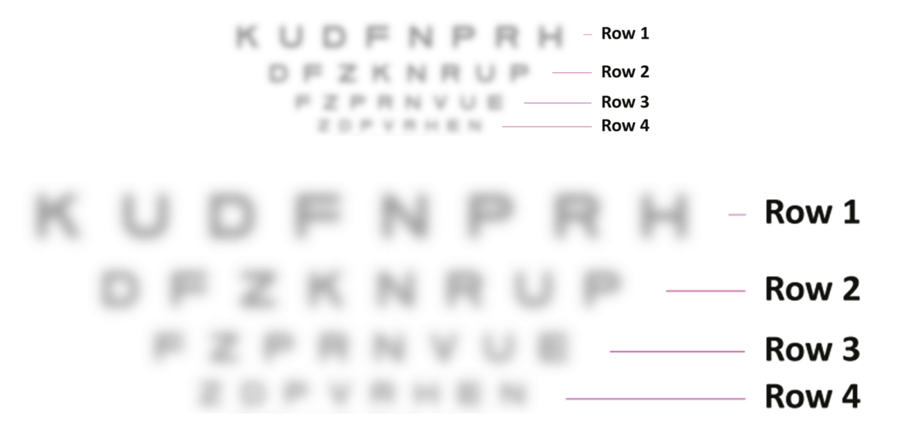
This effect is particularly convenient because it means the screenshot can be evaluated on a large screen monitor, and it doesn't matter exactly how large the monitor is, how far away the assessor is from the monitor, or what the exact zoom level is.
Worked example
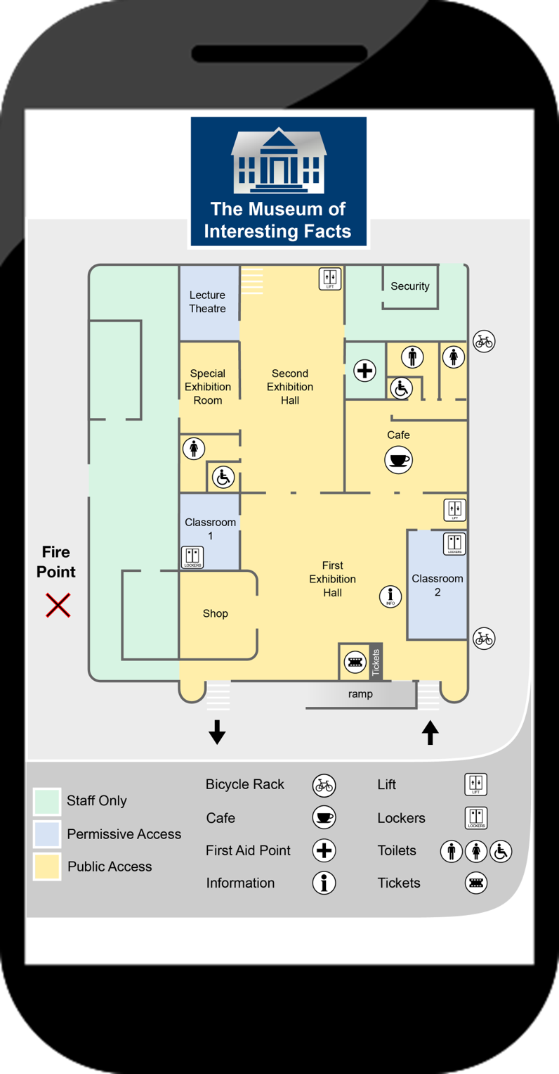
The assessment process will now be demonstrated by assessing some of the graphical features within an imaginary library map for a mobile website, which is shown below.
This imaginary library map was purposefully designed to support the worked example on this page, so it intentionally contains some features that are easy to see, and others that are hard to see. The particular features that are assessed in this example were chosen because they illustrate a range of text sizes and icon shapes that pass or fail the different Clari-Fi Check Levels.
The same process could also be used to assess the other features on the map, or indeed any other icons or graphical features within a mobile app, website or banner advert.
The image will be assessed against each of the Clari-Fi Check Levels in turn (these are named Check Level AAA, Check Level AA and Check Level A). For all the assessments on this page, the screen size is assumed to be 68 mm wide, which corresponds to iPhone 6 / 7 / 8.
Check Level AAA
Check Level AAA applies the most severe level of blurring, so graphical details that remain visible at Check Level AAA are extremely easy to see. When viewed on a mobile device, the percentage of people who might have difficulty perceiving these details is in the range 0-28%*. This can be considered a best practice level of visual clarity for graphical details that are displayed on mobile devices. See the understand page, to find out more about this calibration to population data.
The graphical details within the library map are first assessed against Check Level AAA. Any of the details that fail Check Level AAA are then assessed at less stringent Check Levels. The assessments are done in this order, because it’s better if the assessor hasn’t seen the library map before, and in this way the details of the map are progressively revealed throughout the assessment process.
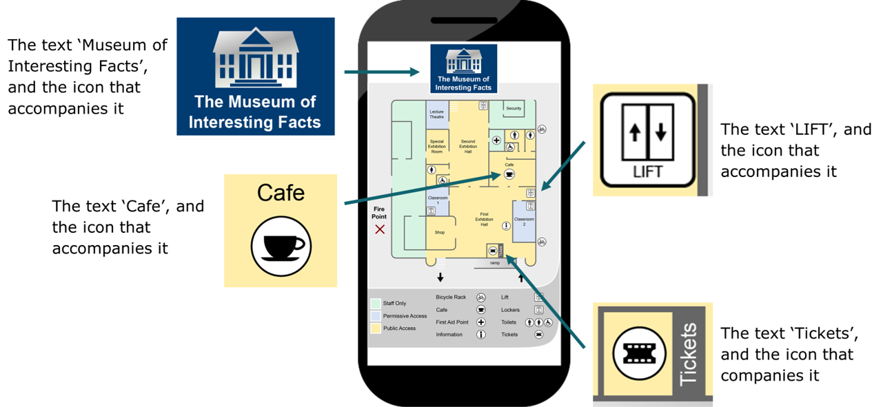
In order to help understand Check Level AAA, the following features are assessed:
- The ‘Museum of Interesting Facts’ text, and the icon that accompanies it. Both of these pass Check Level AAA, so the percentage of people who might have difficulty perceiving these details is in the range 0-28%*. This can be considered a best practice level of visual clarity.
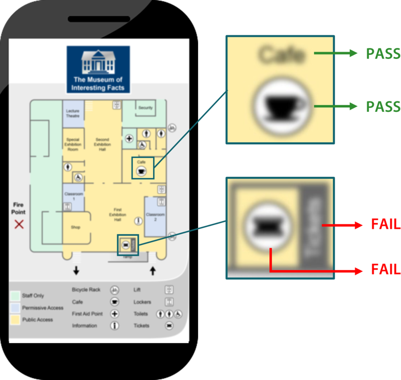
- The ‘Cafe’ text, and the icon that accompanies it. Both of these fail Check Level AAA, so these features will subsequently be assessed at a less stringent check level.
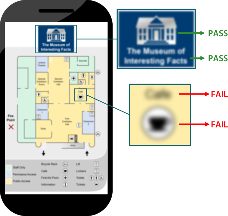
Clari-Fi has processed this screenshot to apply blurring at Check Level AAA.
* Population percentages refer to people who might have difficulty because of visual acuity issues. Some people may have difficulty perceiving these details for other reasons, especially colourblindness.
Check Level AA
Check Level AA applies a moderate level of blurring, so graphical details that remain visible at Check Level AA are reasonably easy to see. When viewed on a mobile device, the percentage of people who might have difficulty perceiving these details is in the range 28-52%*. This can be considered a minimally acceptable level of visual clarity for graphical details that are displayed on mobile devices.
In order to help understand Check Level AA, the following features are assessed:
- The ‘Cafe’ text, and the icon that accompanies it. Both of these pass Check Level AA, so the percentage of people who might have difficulty perceiving these details is in the range 28-52%*. This can be considered a minimally acceptable level of visual clarity+.
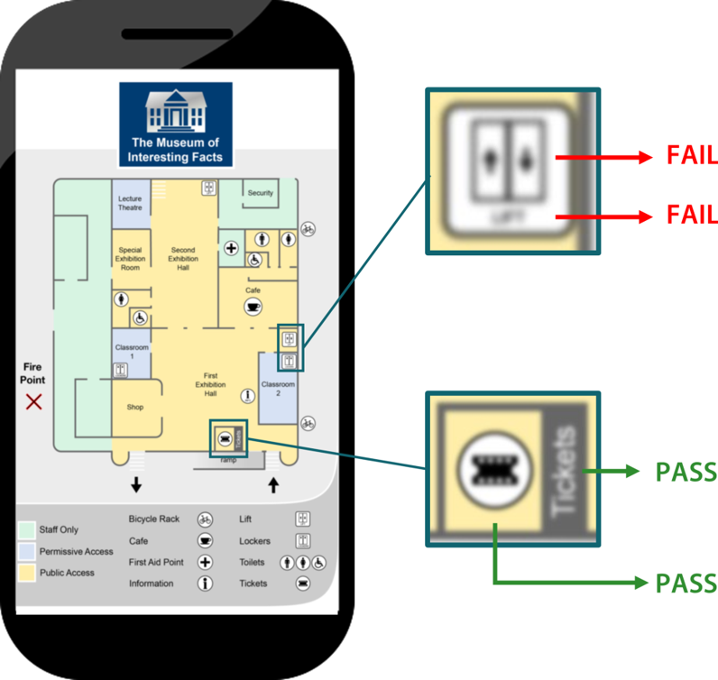
- The ‘Tickets’ text, and the icon that accompanies it. Both of these fail Check Level AA, so these features will subsequently be assessed at a less stringent check level.
Clari-Fi has processed this screenshot to apply blurring at Check Level AA
* Population percentages refer to people who might have difficulty because of visual acuity issues. Some people may have difficulty perceiving these details for other reasons, especially colourblindness.
+ 28-52% of the population having difficulty wouldn’t normally be considered a minimally acceptable level. However, designing for mobile screens is an extreme challenge, and many details within mobile interfaces would be improved if they could at least reach this level of visual clarity.
Check Level A
Check Level A applies a small amount of blurring. Graphical details that pass Check Level A will be visible to some degree, but these do not reach the minimally acceptable level of visual clarity. When viewed on a mobile device, the percentage of people who might have difficulty perceiving these details is in the range 52-100%*.
Details that fail Check Level A are extremely difficult, if not impossible to see. When these details are displayed on a mobile device, they are so small that they are probably beyond the limit of human vision.
In order to help understand Check Level A, the following features are assessed:
- The ‘Tickets’ text, and the icon that accompanies it. Both of these pass Check Level A, so the percentage of people who might have difficulty perceiving these details is in the range 52-100%*. These features do not reach a minimally acceptable level of visual clarity, but at least some people will be able to see them.
- The ‘LIFT’ text, and the icon that accompanies it. Both of these fail Check Level A, so when these details are displayed on a mobile device, they are so small that they are probably beyond the limit of human vision.
Clari-Fi has processed this screenshot to apply blurring at Check Level A
* Population percentages refer to people who might have difficulty because of visual acuity issues. Some people may have difficulty perceiving these details for other reasons, especially colourblindness.
Summary of the assessment process
The Clari-Fi assessment process is summarised as follows:
- Produce a screenshot of the mobile app or website that will be assessed. If this is a 'mocked up' image then it needs to be full width, but not necessarily full height.
- Use Clari-Fi to produce a blurred version of the screenshot.
- On a large screen laptop or monitor, show the Check Level AAA version of the screenshot to someone who hasn't seen this particular website or app before, but is familiar with similar interfaces.
- 'Zoom in' on the particular details that you want to assess, and ask the assessor if these details remain perceptible, quickly and with certainty, despite the applied blurring.
- If the graphical details fail at Check Level AAA, then the assessment can be repeated at Check Level AA, and then again at Check Level A. The assessments are done in this order, because it’s better if the assessor hasn’t seen the graphical details before, and in this way the graphical details are progressively revealed throughout the assessment process.
- The next panel describes how these Check Levels are calibrated to population data.
The level of blurring that's applied by Clari-Fi is calibrated to survey data that was gathered using a handheld test card, so the design team can be confident that if the graphical features of their websites, apps or banner adverts appear 'easy to see' in the blurred version of the mobile screenshot, then the vast majority of their users will find these features 'easy to see' on their mobile devices.
Summary of calibration population data
The following table summarises how the different Check Levels are calibrated to population data.
| If the details within the image remain perceptible at … | then the percentage of people that might have difficulty perceiving these details is … | and the conclusion is … | ||
|---|---|---|---|---|
| Check Level AAA | 0-28%* | Best practice | ||
| Check Level AA | 28-52%* | Minimally acceptable+ | ||
| Check Level A | 52-100%* | Not good enough |
Details that fail Check Level A are impossible to see. When these details are displayed on a mobile phone screen, they are so small that they are beyond the limit of human vision.
If you want to find out more about the survey that underpins the population data within this tool, see the understand calibration page.
* Population percentages refer to people who might have difficulty because of visual acuity issues. Some people may have difficulty perceiving these details for other reasons, especially colourblindness.
+ 28-52% of the population having difficulty wouldn’t normally be considered a minimally acceptable level. However, designing for mobile screens is an extreme challenge, and many details within mobile interfaces would be improved if they could at least reach this level of visual clarity.
Feedback
We would welcome your feedback on this page:
Privacy policy. If your feedback comments warrant follow-up communication, we will send you an email using the details you have provided. Feedback comments are anonymized and then stored on our file server. If you select the option to receive or contribute to the news bulletin, we will store your name and email address on our file server for the purposes of managing your subscription. You can unsubscribe and have your details deleted at any time, by using our Unsubscribe form. If you select the option to receive an activation code, we will store your name and email address on our fileserver indefinitely. This information will only be used to contact you for the specific purpose that you have indicated; it will not be shared. We use this personal information with your consent, which you can withdraw at any time.
Read more about how we use your personal data. Any e-mails that are sent or received are stored on our mail server for up to 24 months.